 Acadia Learning brings scientists, teachers, and students together in partnerships that result in useful research and effective science education.
Warm-up 1: Heads or tails?
The goal of this activity is to demonstrate that there is natural variability when we make measurements and observations.
The research question for this activity is:
Is there a difference between Canadian and American coins in a coin toss?
Materials
For each group or student, you will need:
- 1 Canadian and 1 US coin (nickels work great).
- Paper and pencils or overhead transparencies and markers
Doing the Activity
Have each group flip the Canadian coin 10 times, then the US coin 10 times. Record the number of heads resulting from the tosses.
The teacher compiles the data on an overhead or white board. Go around the room asking each group how many “heads” where thrown for each type of coin. Calculate the mean for each coin type. An example of the data compilation follows:
| Group | Canadian heads | US heads |
| A | 6 | 5 |
| B | 4 | 6 |
| C | 5 | 5 |
| D | 7 | 8 |
| E | 3 | 4 |
| Mean: | 5.0 | 5.6 |
Pose the question: is 5.6 enough of a difference from 5.0 that we would think it’s a meaningful difference (due, for example, to differences in how the coins are made) or just from random variability (or chance)?
To delve into the question, repeat the coin toss a second time. Record the results and calculate the means. Are they the same or different? If you tossed coins again, would you get the same or different values? Why?
The differences between the two types of coins and among the different trials are most likely due to chance. There are just natural differences in coin tosses that make the tosses different each time. Discuss some sources of variability with your students (tossing style, if a coin is worn, dirt on one side, etc.)
To look at the variability more closely, plot the data on the board or overhead. There are two types of plots we’ll use to look at variability among groups of things: a dot-density plot (a type of histogram) and a box and whisker plot.
Dot density: this type of graph shows how many times a certain value appears in your data set. Use different symbols or colors to denote the US versus Canadian toss results.
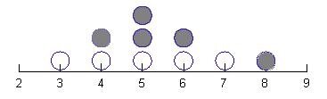 For the example coin toss data above, it would look like this, where open circles represent Canadian coin tosses and filled circles are US coin tosses:
This graph is like a histogram – it’s counting how many times you got each value. So, for this data set, 3 heads came up once, 4 heads came up twice, etc. You can also do this more kinetically, drawing the number line scale on the board and giving students post-its (again, colored by coin type) so they can stick their values on the board and make a stack above each number (imagine that each dot above is a post-it).
Use this type of graph to begin seeing the mean, or ‘balance point’. Where are most of the points? Is there a big bump near a certain value? In the dot density plot above, most of the data are centered between 4 and 6, with the greatest number of points at 5. The 3 and the 8 are less common values. If you calculate the mean (see above), it’s near 5, which makes sense when you see where the data mostly lie.
 Talk about variability. Do the two sets of measurements (Canadian and US) overlap a little or a lot? If you were to do another trial, what would you predict?
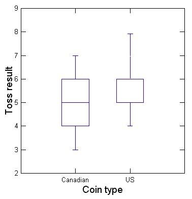
A second, useful type of graph is a box and whisker plot (at right, sometimes just called a boxplot). The boxplot groups the Canadian and US coins on the X (horizontal) axis, and the height of the various parts of the box represent the Y values (number of times heads came up).
More specifically, the line across the middle of each box here represents the median, or middle value. No calculator needed – just put the measurements in order and see which one is in the middle. For Canadian coin tosses, you had 3,4,5,6,7 – so 5 is in the middle.
Then, you want to plot the middle 50% of the data (called the interquartile range – between the two middle quarters). If the middle (median) is 5, then 25% of the values are from 4-5 and 25% are from 5-6. The “whiskers” represent the outer quarters of data (technically, most statistics folks will tell you it’s the 95th and 5th percentiles). So in our Canadian toss example, the whiskers go to 7 and 3. In the case of the US coins plotted above, the median and the lower interquartile range happen to be the same because 5 appears twice. So, you just can’t see the line across the middle of the box – because it’s the same as the line at the bottom of the box.
We use a boxplot because we can compare the data overlap again, in order to talk about variability and whether the two groups have meaningfully different data. If half of the Canadian data (the interquartile range) are shifted and don’t overlap much at all with the interquartile range of the US data, then we’d think we might have a meaningful difference. If, as in this case, the boxes mostly overlap, then we may not have a difference that means much.
Warm-up 2: Point up or point down?
 The goal of this activity is to build on Warm-up 1, with a more data-rich experiment.
Materials
For each group or student, you will need:
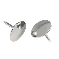
- 20 thumbtacks (not pushpins, but flat-head thumbtacks)
- 20 upholstery tacks (get them at the hardware store)
- 2 paper cups
- Paper and pencils or overhead transparencies and markers
Doing the Activity
First, have teams inspect the tacks and make observations. What’s the same about them? What’s different?
Then, ask them – when tossed (like dice), which ones do you think are more likely to land with the point facing up? Have them tie their hypotheses to an observation (e.g., “We think the upholstery tacks will land point-up more often because they have a heavier head”).
Each group then throws a cupful of tacks (they can decide on the method – whether each type should be thrown separately or not) and counts the number of points facing upward. Repeat 10 times for each type of tack. Each group should record the number of each point-up tacks for each throw and each tack type.
Have each group plot their data as a box plot. Ask: was there a difference between upholstery tacks and thumbtacks? Compile all the data into one graph for the class. Were the results the same for all the groups? What does the variability look like? Is the difference meaningful (look at the interquartile range and the overlap compared between the two types of tacks).
Warm-up 3: It’s a stretch
 The goal of this activity is to become familiar with scatterplots, the graph type used when looking at correlation (are two things related?).
Materials
For each group or student, you will need:
- A stick (1x1 lumber, about 3’ long) with two cut, tied together rubber bands attached to one end (like a fishing pole) and a binder clip attached to the loose end of the rubber band
- A ruler
- 8 washers of different sizes and weights, about 30-60 grams each; it’s helpful to paint washers a few different colors (reds, greens, blues) and number them 1-8
- A balance or other way to weigh the washers
- Paper and pencils or overhead transparencies and markers
Doing the Activity
Have each group create a data table with washer #, color, and a space for washer weight and stretch:
| Washer # | Color | Weight (grams) | Stretch (cm) |
| 1 | Green | 45 | 12 |
| 2 | Blue | 30 | 8 |
| 3 | Blue | 55 | 18…etc. |
Weigh a washer, then clip it to the rubber band and measure the amount the band stretches. Record the weight and stretch length in the table.
Continue to weigh and measure stretch of all the washers.
Have students make a graph of their data. You can leave this fairly open ended to see if they’ll get tripped up by the washer numbers or colors. The goal is to put weight on the X-axis and stretch on the Y-axis to see if weight and stretch are correlated.
Once graphs are made, have each group report out or present to the class. Was washer weight and stretch related? How? Do the points fall on a straight line (linear) or are they curved? (They should be linear). Did the washer color or number matter? (They do not). Point out that it’s important to figure out which pieces of data are useful here. When the question is whether or not washer weight and stretch are related, the other data don’t matter.